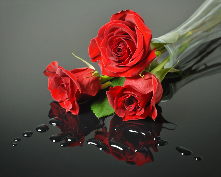
Three Roses
|
Specs:
Aperture: f8 Shutter: 1 second ISO: 100 Exposure compensation: -1 stop Matrix metering Focal length: 50 mm Nikon D200 Post processed in Photoshop Elements 10 |
|
The Setting
This shot was taken in January 2013 as part of a photo competition, where the theme was Still Life. The weekend before I took this shot, I had picked up a dozen roses for my wife’s birthday. Looking for a Still Life subject, I decided to take advantage of the flowers and use them as my subject.
This shot was taken in January 2013 as part of a photo competition, where the theme was Still Life. The weekend before I took this shot, I had picked up a dozen roses for my wife’s birthday. Looking for a Still Life subject, I decided to take advantage of the flowers and use them as my subject.
|
Equipment
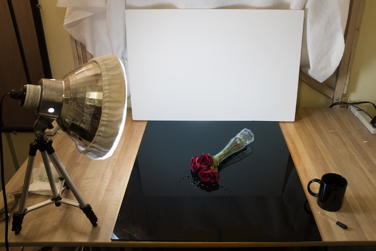
For this setup, there were several items that I had used. On top of a table, I placed a 2’x3’ sheet of black acrylic – this provided the source for the black back drop and the reflections. You can get this material at sign shops and some home improvement stores. A sheet this size cost me about $40 a few years back. I then used a sheet of white foam core board, standing vertically, just beyond the top of the picture. The white gradient seen in the picture is simply the reflection of the |
|
foam core board off of the black acrylic. Closer to the board, the reflection is stronger, showing up whiter. Further from the board the reflection is weaker, creating the gradient from top to bottom.
For lighting, I used a single light source. It was continuous lighting, with a 14 W CFL photo bulb, daylight balanced to 5500K. The bulb was in a 12” reflector, with a diffusion screen over the top. The light was at roughly a 45 degree angle relative to the camera position, and was pointing downward at about 45 degrees.
I also used an eyedropper to position the water droplets. This gave control over the placement and size of each droplet.
Composition
While positioning the flowers, it was important to keep in mind that the vase and flowers need to lie entirely within the reflection of the foam core board in the black acrylic, in order to keep the white gradient smooth across the picture.
In laying out the composition, I wanted to have a strong diagonal. Strong diagonal elements give an image a dynamic feeling, and tend to make for a stronger image. The bottom of the vase starts in the upper-right corner and points downward towards the center. This provides a strong leading line into the roses. In addition, I positioned the water droplets such that lines through the droplets start at the corners and lead into the roses as well. These 3 lines provide visual clues to direct the viewers’ eyes directly into the flowers. When a viewer looks at an image and sees a strong sense of a line, the viewer’s eyes will naturally follow the line through the image. Strong lines, then, should always point towards the subject of the picture.
I had a dozen roses from which to pick my subjects. Unless flaws in your subject are somehow related to the story you want to tell, it is usually recommended to select subjects that are in the best condition possible. For this image I selected the 3 roses that had no visual flaws in the petals. Also, I intentionally selected 3 roses, rather than 2 or 4. Images with odd number of items as the subject tend to be stronger than images with even number of items. This produces a more dynamic feeling image.
When I first laid out the 3 roses, the middle rose was resting directly on top of the 2 lower roses. I used a small block underneath the middle rose to lift it up and provide a small amount of spacing between all three roses.
Lastly, I took a leaf and placed it between the 2 lower roses. The intent of this was to provide some color and contrast between the 2 lower roses.
Technical Settings
Since this shot was taken in the studio, nothing was moving and the camera was on a tripod. As a result, I put the camera in aperture mode, allowing the shutter speed be what was needed to get the exposure. Since my lens is sharpest around an aperture of f8, I selected that as my aperture. In order to minimize any impact of noise, I also selected an ISO of 100. For still life and product images, these are fairly typical settings for me.
Since a lot of the image is black or dark grey, leaving the camera on auto exposure with no adjustment would have overexposed the image, as the camera would have tried to make the image balance out to 18% grey. To maintain the darker aspect of the foreground, I used matrix meeting with -1 stop exposure compensation. This tells the camera to select the correct shutter speed needed to get a “correct” exposure (what the camera thinks is correct to yield an 18% grey exposure) based on the selected aperture and ISO, and then reduce that shutter speed by 1 stop. A 1 stop decrease in shutter speed means cutting the shutter speed in half.
Post Processing
The one drawback with using black acrylic is that it shows every tiny bit of dust and smudge. Even though I was very diligent in cleaning the acrylic before shooting, a lot of specks still showed up in the final image. I used both the cloning tool and the spot healing tool to remove these items.
Other than removing the dust from the acrylic sheet, the amount of post processing done on this image was minimal. I made a slight adjustment in contrast, and sharpened the image. I used a mask to slightly brighten the flower reflections, and cloned out the block used to lift up the middle rose. I then added a small vignette. A vignette is a slight darkening of the image around the edges. This acts as a subtle frame around the image, directing the viewer towards the center of the image.